Showing posts with label Page Experiments. Show all posts

Tuesday, 24 April 2012

Experiment Evaluation...

Texture and Decoration

I think the decorative backgrounds look better with a simple acrylic painting as the bold colours of the paint stand out more against the busy textured background.

My pen drawings, on the other hand, seem to get lost within the patterned background. Perhaps as they are quite intense with detail and use just one colour it's not as easy to fight against a background which is also quite busy - the eye isn't drawn to either the image or the background as there is too much going on within the page.

Collage

I like how the collage experiments turned out, and though I think children would enjoy the bold colouring and simple shapes, I would still prefer to have more detail in my illustrations.


Conclusion

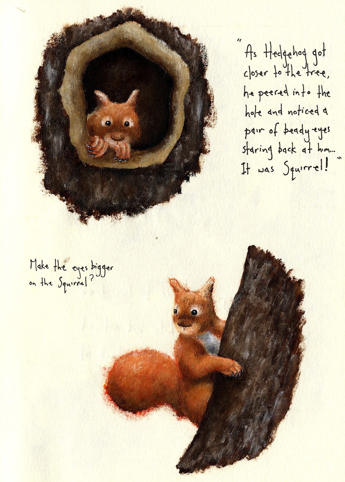
Out of all the drawings I have done, I prefer just the plain acrylic paintings and the plain pen drawings.

Style example of what I would prefer to use in my illustrations...

After careful consideration, I have decided to proceed in doing my illustrations with acrylic paint.

Using paint offers me the opportunity to create bright, colourful, images, as well as allowing me the scope to create a 'cute' softness to the animals using different brush techniques - perfect for catching the eye of both adults and children!


Monday, 23 April 2012

Image Experiments Continued...

Pages 3 and 4

Here are a few design ideas I have for my third and fourth page...


Pencil sketches

I have decided to try out some of the experiments I have been using on my Hedgehog pages with my designs for the Squirrel pages. I think if I try them out on a couple more pages, I will get a better sense of it's continuity and the possible potential it may have to work as a whole book...


Pen sketches for pages 3 and 4


Acrylic paintings for pages 3 and 4


Using the above sketches, I've created some more pages using a mixture of acrylic paintings, pen sketches and decotrative patterns.


I like how using a mixture of styles is quite unique, but I still don't think these illustrations have the right look that I'm after for my children's book...


Image Experiments Continued...

Pages 1 and 2 Continued...

Here I have developed some more illustrations that encompass the collage/decorative theme in which I have been experimenting in...

In the images below, I have tried to brighten up the pen drawings by using bright watercolour washes.


After looking at the work of illustrator Sara Fanelli - who works mostly in collage - it gave me a couple of ideas for my work to again take a different direction...

'First Flight'
Illustrated by Sara Fanelli
  
'Pinocchio'
Illustrated by Sara Fanelli


In the illustrations below, I have used collage to make the trees in the bottom image, but put my own stamp on this method by using my potato prints in the top image.
I have also used a 'quirky', decorative font, much in the same way that Sara Fanelli uses in her books.


I like how the collage experiments have turned out, and though I think children will enjoy the bold colouring and simple shapes, I would prefer to have more detail to my illustrations.

Image Experiments...

Pages 1 and 2...

Here are a couple of composition ideas for my first page...


Out of the two ideas, I prefer the illustration on the left as it gives the audience an introduction to the character as a whole, as well as creating an interesting pose/angle for the Hedgehog to be viewed from.

After deciding on my preferred illustration, I used it as a starting point to experiement and develop on...

In the above illustration, I've kept the same composition to the Hedgehog that I decided on in my first sketch, but instead I've used a different medium (pen), as well as adding in some text and a paw print decoration.


In the two above illustrations I've used photoshop to layer the same black and white drawing of the Hedgehog over one of the leaf prints I created, just changing where I have placed the text.

I like the decorative aspect of having the leaves in the background as it fills up blank space and adds a second interest to the page, but on the other hand, I think it does become slightly detracting from the main illustration. I'm also not entirely happy with the way the illustration sits on top on the leaf pattern, it looks too 'placed' and therefore doesn't compliment the composition the way I would like it to.

When I look at other artists that use collage or decoration in their work - like Lauren Child - the illustrations and decoration look more natural together, like they go hand in hand. I've also noticed the drawings in said illustrations tend to be quite simple looking and not as built up and detailed as my pen drawings, so next I shall try a simple colour illustration to go with a patterned background instead.


'Clarice Bean, That's Me'
Illustrated by Lauren Child
'Clarice Bean'
Illustrated by Lauren Child


In the below illustration, I've painted just a simple acrylic Hedgehog on top of a leaf pattern on brown paper. I've used earthy tones in the background to mirror the seasonal feel of Autumn.
I think my colour illustration does look better on a patterned background, yet I am still not convinced about using this style to complete the rest of my illustrations in as I think the characters get abit lost within the pattern...


In the above illustration I have used a plain background page opposite a patterned page.
I think in terms of clarity, this design is probably more successful. The main illustration is left clean with a white background so it can be observed easily, whilst the page which has less going on in it has a leaf background to make it look more interesting.